One of the major benefits HTML5 / JavaScript holds over native applications is the power of CSS (cascading style-sheets). CSS is a simple way of describing the visual attributes of something, from the size and color of the font to the thickness of borders and even animations. You can even position elements in 3D space if you like using nothing but CSS.
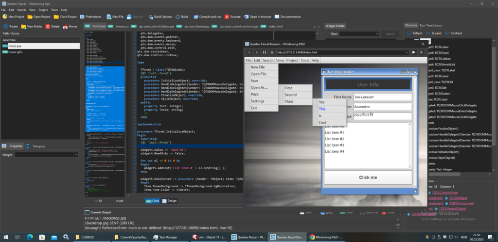
A CSS file contains the definitions of such styles called style-rules, and once defined you can change everything about your UI with barely any effort. A style rule simply defines a list of attributes and the values you want them to have. Here is an example of a style-rule:
.ExampleStyleRule{
  margin: 2px;
  padding: 4px;
  font-color: red;
}Note: While the technical term for such a definition is style-rule, most people simply say style. So when I refer to a style in this article, unless otherwise stated I am referring to a single style-rule definition.
A HTML application can load and use any number of CSS files, which makes it easier for developers to organize and manage styling for their applications. You can have animations in one file, widget styles in another and color definitions in a third. There are some very good CSS visual editors online as well, that you can use to generate complex CSS. Then you can copy and paste the result into a CSS file and use it in your QTX projects.
CSS is vast and covers a plethora of attributes, but for sake of brevity we group the attributes involved into four distinct categories:
- Visual attributes: border, background, shadows, visibility, opacity; anything visual
- Behavioral attributes: width, height, padding, margin, clipping and layout
- Animation attributes: rotating, flipping or moving an element using hardware acceleration, or moving an element in 3D space
- Typeface attributes: font names, families, their weight and orientation (note that I did not list color, since that is a visual attribute)
There is much more to CSS than these four categories, but if you are unfamiliar with CSS – these four gives you a rough overview of the terrain. Every inch of a HTML element can be altered in some way through CSS, the question really comes down to how do we organize this in a system that makes sense.
This is where the QTX theme ( or scheme ) comes in.
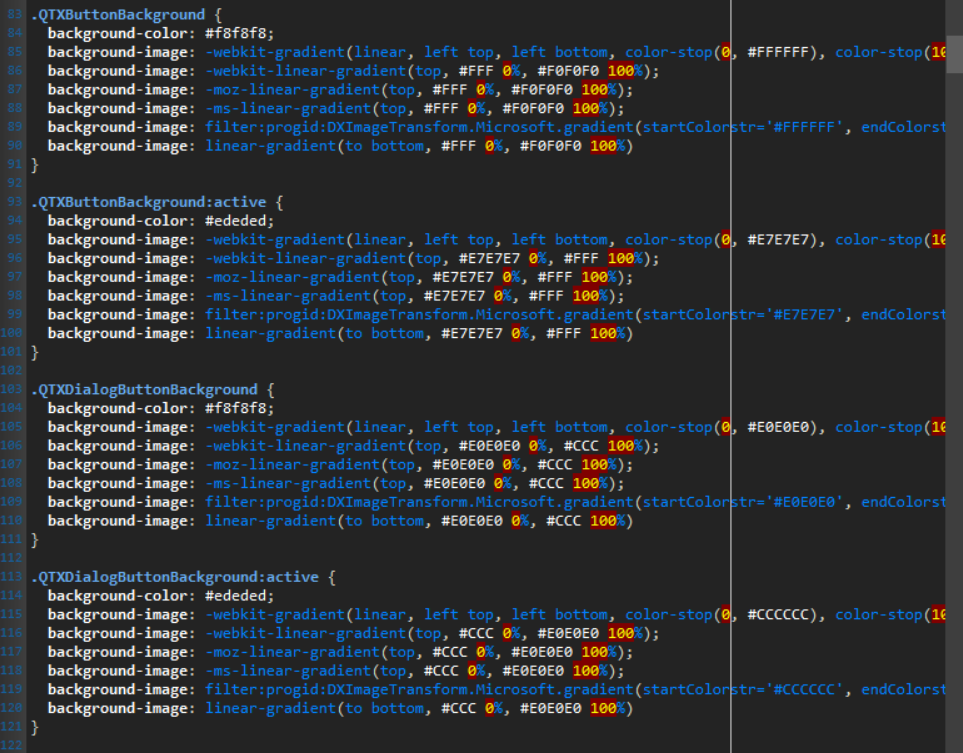
QTX Style Guidelines
In order to bring uniformity and structure to how component writers work, the IDE operates with a few basic laws or guidelines for using or creating your own themes. These laws are simple and non-intrusive.
If you want to deal with the styling yourself and ignore how QTX does things, that is not a problem! It is very important that QTX don’t get in the way of whatever styling developers write themselves, or collide with existing JavaScript frameworks and their styling schemes. But let’s look at how the RTL is rigged to work with theme-files, which is just a normal CSS file with a set of pre-defined, named style-rules.
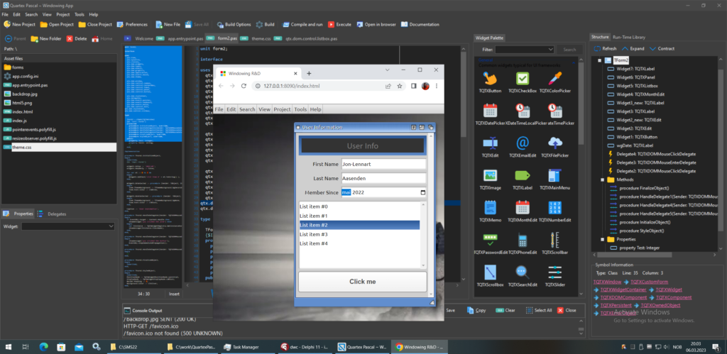
First, these are the guidelines for those that wish to create their own theme files. These guidelines must be followed since the RTL and IDE expects this scheme to be in place.
The theme-files divides the styling of a widget into 4 parts: border, background, font and behavior. We dont have styles that mix the attribute groups I mentioned earlier. A border style should just affect the border, a background style should just affect the background. In the RTL we apply multiple styles to a single widget, this is how you can change the border without affecting anything else (!).
- Border styles must only affect how a border is visually represented
- Background styles must only affect the background
- Font styles only affect the font size, weight and pitch. You can set the name of the font if you wish, but the theme-file defines a font for the entire theme, which the rules inherit from. But you are free to override this if you wish.
- Behavior, size and layout should exclusively be defined in a style that match the Pascal class-name of a widget. TQTXToolbar, TQTXButton and so on all have corresponding style-rules in the themefile.
- All TQTXWidget based controls will add their own pascal class name to the style-collection of it’s HTML element (all widgets create and maintain a HTML element, in most cases this is a DIV) during initialization of the widget.
- Widget writers should provide a CSS file in their package that contains style-rules for their Pascal widget class-names. This ensures that element + basic behavior is established instantaneously on creation.
The last 3 items of these guidelines will be confusing to anyone unfamiliar with CSS, they mostly affect advanced developers that write their own packages
Ad-Hoc example
Let us have a look at a direct example of the style mapping mentioned above. First, let us write the smallest possible TQTXWidget we can think of:

You can ignore the [RegisterWidget] and [RegisterInfo] pascal attributes, those just ensure that the IDE registers the widget on the component palette in the IDE when the package loads. Just focus on the class definition for now. And yes, this is a fully working widget, albeit a bit useless.
With the pascal code in place, we need a matching CSS style-rule. Like mentioned already, the widget will add it’s own Pascal name to the list of styles it uses – so all we need now is to have a CSS rule with the same name (note: user styles are prefixed by a dot [.], this is not custom for QTX but a part of the CSS standard).
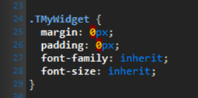
The above CSS is a fair starting point, and like the guidelines explains, automatically mapped styles should only define behavior essential to the widget. Attributes like padding, margin, minimum size, anything that helps setup the structure of the widget rather than it’s visual attributes.
With our pascal widget and CSS setup, let’s provide a default border and background for the widget. This is done by overriding the StyleObject() method and setting the ThemeBorder and ThemeBackground properties there:
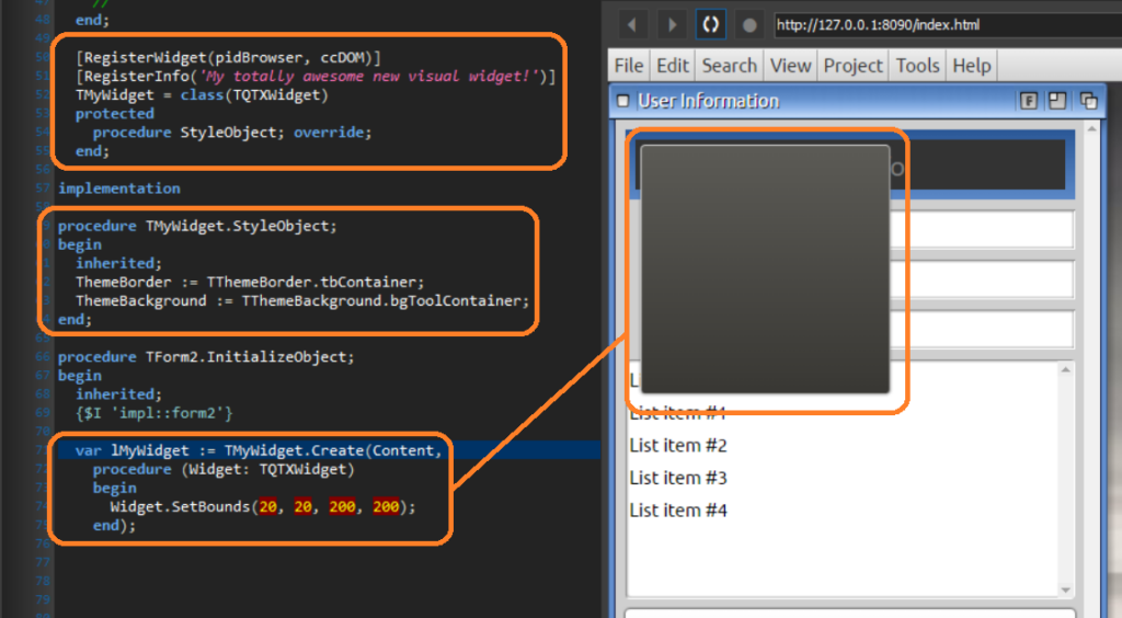
Widget writers who deliver packages with new and cool widgets for developers to use, just have to provide a CSS file inside the package. When a project using that package compiles, the data-files are copied into the current project automatically by the IDE. The user just have to add the styles to his index.html document. This is literally a one liner operation.
This is the beauty of the QTX scheme. The extreme ease of use, letting the browser deal with as much composing as possible, and try to match things up through logic rather than brute force.
The new qtx.dom.theme unit
The theme system operates with a set of named styles that all widgets must follow. Sure, you can roll your own and ignore the system, that is perfectly fine, but the RTL based widgets are all rigged to use the QTX scheme.
A fair bit of thought has gone into this system, and the borders, backgrounds and colors are made to compliment each other. Developers making their own CSS theme files obviously should ensure they pick colors that go well with each other. For example, the border TThemeBorder.tbButton is made to work well with TThemeBackground.bgButton background type.
In the upcoming release a new unit has been added to the QTX.DOM namespace, namely qtx.dom.theme.pas, which contains the enum types used by the theme files and IDE scheme.
Most importantly is that TQTXWidget has been expanded with two new properties:
- ThemeBorder: TThemeBorder
- ThemeBackground: TThemeBackground
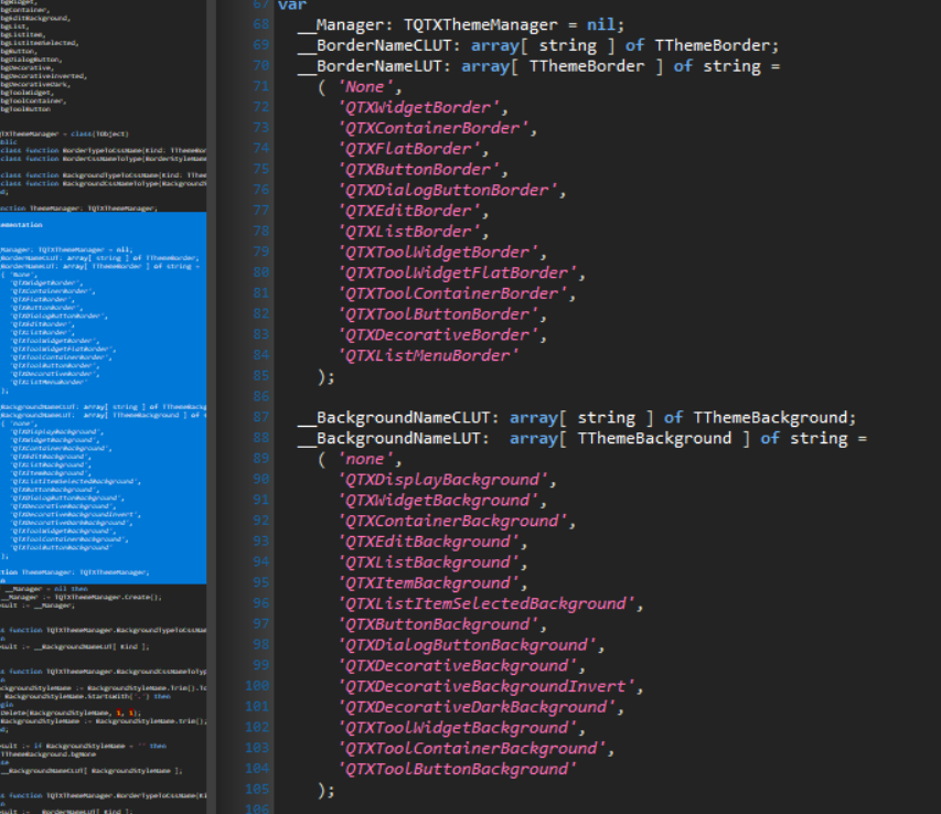
These enum types are straight forward in what they represent, and they are simply used as keys into a series of lookup tables in the unit dealing with name-to-type conversion.
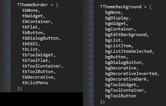
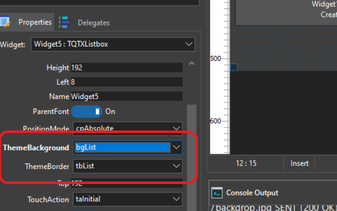
You don’t really have to deal with this unit directly unless you want to. The new TQTXWidget properties are available from the form designer and widget inspector.
From the form designer and widget inspector, it’s straight forward. You can change the border and background of any widget.
Windowing is special
The windowing UI that QTX ships with requires a bit more than just border and background styling, so that is somewhat bolted into the theme-file. However, a window is clearly defined in parts (header, footer, content region etc.) so new theme files will definitively contain new look and feel moving windows too.
I am considering separating the window styling into a separate file, so that it’s not subject to whatever color preferences has been set by a single theme. This will require a bit of contemplation before I change it since the window structure is far more complex than a simple, composite widget.
Well, I hope this was informative! More info will be available shortly!